Since our platform launched, we’ve been collecting user feedback with suggestions about how to improve the site. Thanks to the helpful comments we’ve received, we have added a suite of new features and improvements to the platform. Continue reading for more details on new features, bug fixes and improvements included in update 1.4.0.
NEW FEATURES AND IMPROVEMENTS
- We updated our “dark mode” colors to be accessible (WCAG AA) for users with color vision deficiencies. We will roll out additional color updates over the next few months and will continue to strive to make the platform more open and accessible to all.
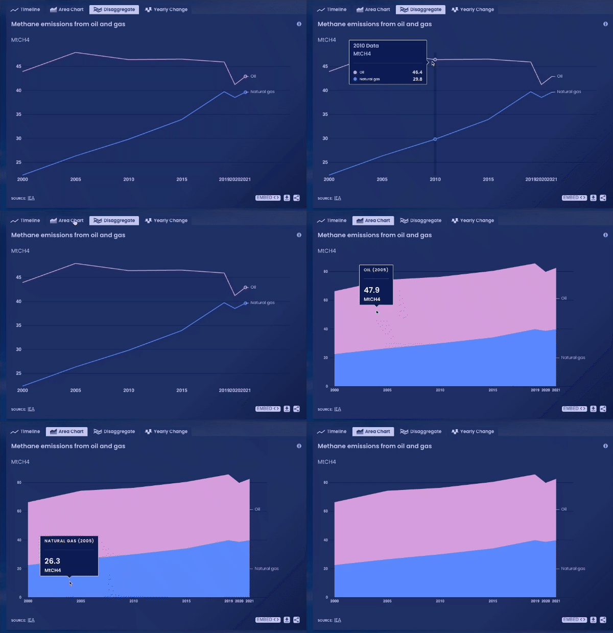
- We added a new chart type. When data is available, there are now five different ways to view charts: timeline, area, map, disaggregate and yearly change.

- Large charts no longer default to show the timeline view; instead, charts now show the best visualization available for the specific indicator.
- We improved visualizations for indicators with only one year of data. Single data points are now shown as a bar instead of a data point, and we now display disaggregations for a single year.
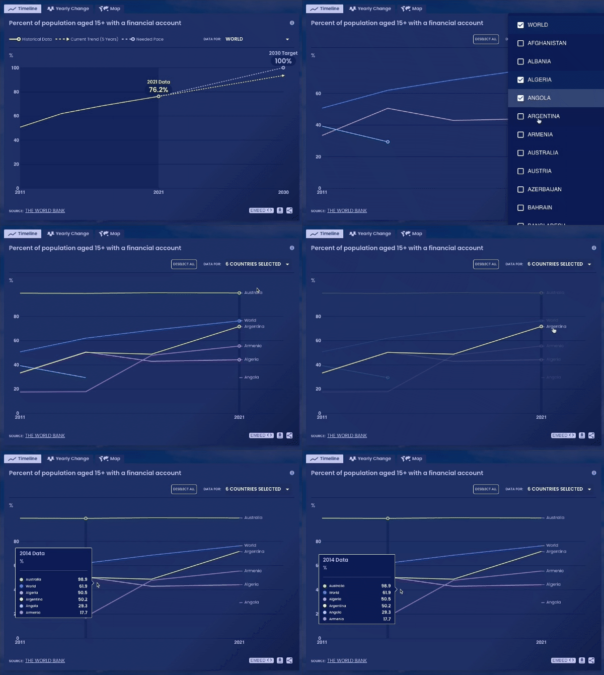
- Timeline charts now support multi-country comparisons. You can select up to 10 countries to compare, where country data is available.

- The style of downloadable indicator PNGs has been updated for the timeline and yearly change charts.
- The pinwheel visual no longer spins on our dashboard.
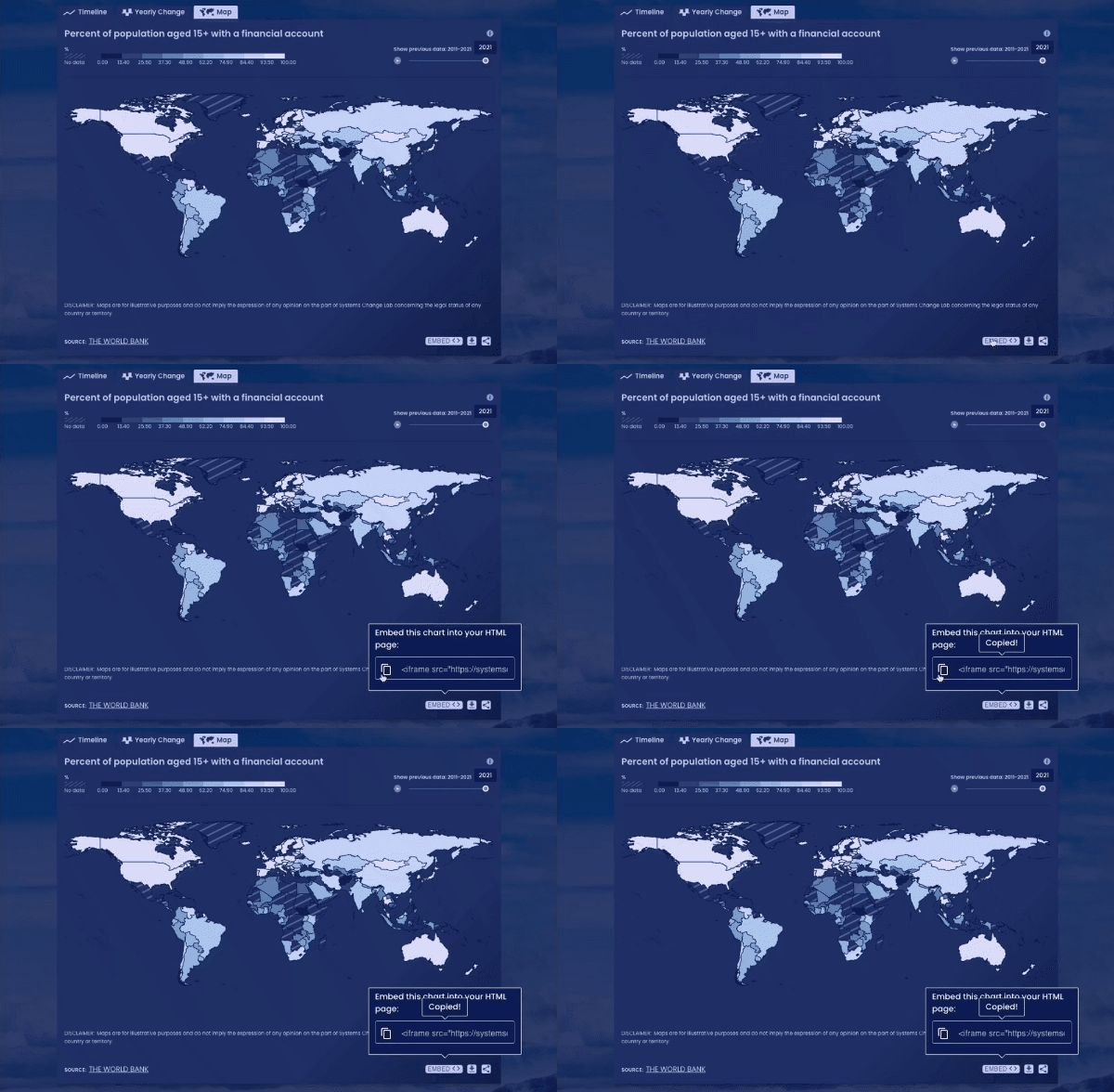
- Large charts are now embeddable. Navigate to any large chart on a shift page and click “embed” at the bottom right to add the chart to your own website.

IMPORTANT FIXES
- Yearly change charts previously used an incorrect formula to calculate the rate of change. This error has been corrected.
- We’ve updated maps to use a natural breaks interpolation instead of linear interpolation.
There are exciting updates coming down the pipeline! Subscribe to our newsletter to be the first to know when we launch new features and improvements, and email us if you have questions, comments or bug fixes to report.